Tuesday, April 11, 2017


Friday, April 7, 2017
Just a Few Finishing Touches
Soooo... Today I spent the day writing and laying out my two page spread. I found an amazing layout in Travel and Leisure which i will be using to base my two page spread off of. I did lots of research about the background of Mardi Gras and its impact on New Orleans and it has turned out great. It really captures the essence of the amazing city. The advertisement is also done. It is a luggage advertisement which coincides with the travel theme. It shows a woman getting home from vacation walking into her front door with her suitcases behind her. This really captures the usefulness of these suitcases and will attract buyers.
I also started to plan out my CCR and figure out any visuals I will be adding to the video to make it more intriguing. I am so so busy finishing up this magazine. All i have left is just a few finishing touches and recording of my CCR and its all ready to go!!
I also started to plan out my CCR and figure out any visuals I will be adding to the video to make it more intriguing. I am so so busy finishing up this magazine. All i have left is just a few finishing touches and recording of my CCR and its all ready to go!!
Thursday, April 6, 2017
The End is Approaching...
As the deadline approaches, I keep on coming up with all these things I can do to my magazine to make it better.
Cover Page: Check!
My cover page has been complete for a while but when I added an additional page, I decided to add another cover line which you will read about down below. The page is exactly what I hoped it would be and I'm really happy with the outcome!
Table of Contents: Check!
Starting with the table of contents. All of the pictures are now horizontal instead of vertical and it looks much better. Also all of the subheadings of the pictures on the table of contents are done as well. So I can check the Table of Contents off my list of things to complete.
Additional Page: Check!
While looking through a Travel and Leisure magazine I saw something that caught my eye (i posted it in my last blog post). It was a map of a bunch of different cocktail bars in London. As I went through my camera roll, I saw a bunch of pictures of food I've eaten while I was in New Orleans and thought I would incorporate that into my magazine as well. So I decided to make an additional page with 4 of my favorite places to go while I am in New Orleans. The pictures include a poke bowl, a salad, a bagel platter, and an ice cream roll which you will further see when I post my final magazine.
Advertisement: Incomplete
Since I added the additional page, I have to add one more page to make the amount of pages even. So I will add an advertisement. I have to wait until my mom gets home from work so I can do a quick photoshoot with her. I am planning on doing a luggage advertisement to go along with the travel theme. It will be her walking through the front door after a long vacation with her two suitcases behind her.
Two Page Spread: Almost
I completed my layout of the two page spread. It has three pictures up at the top. A smaller one on the left and right and a larger one in the middle. I have so many pictures from my trips and Mardi Gras that I want to use as many as possible to really capture the culture of New Orleans. I have not yet written the content that will be going on the page but I have a lot of stuff in mind. The title on the spread is "Laissez le Bon Temps Rouler" which means let the good times roll in French. This is a commonly used phrase all throughout New Orleans and thought it would be a great idea to incorporate it into my magazine.
Today and tomorrow will be dedicated to finishing all the final touches on my magazine and starting to think about my Creative Critical Reflection. Almost done with this journey but its not over yet:)
Sunday, April 2, 2017
Some Inspirations from Travel and Leisure
While looking for some inspiration for doing an advertisement, I looked in a Travel and Leisure magazine to see how they laid out their advertisements. They decided to place an ad in between the table of contents. If Melanie and I choose to take this route, we would both need to plan an advertisement very soon.


Another idea that was going through my head is to do an insert on What to Pack or the hottest food locations... The What to Pack section includes key necessities the director believes is a great addition to their travels. The map of the cocktail bars shows great places to check out in London which can easily be related to New Orleans as well. Maybe Melanie will do the What to Pack and i'll do the food because it relates perfectly to our travel destinations.


These both look like great additions to add to my magazine and will further discuss with Melanie tomorrow for her advice.
Saturday, April 1, 2017
PSA
Sooooo..... we've made another major change in the magazine. We decided to change the mast head to Excursion from Excursionist. We made this choice because it fits better on the page and doesn't look as smushed. We placed it in the center at the top and it looks great. In our opinion, Excursionist is specifically the traveler and Excursion is more of the journey so we thought Excursionist would fit our magazine better.
My partner Melanie and I have been able to talk out the different options we have and testing them out to see which we should use. We are trying to do the best for our magazine and are willing to take each others advice along with our classmates.
Tomorrow and next week we continue the journey of making the two-page spread. We will also come up with cover lines for our table of contents and thinking about an advertisement to put in the middle.
Here is a few links we gathered to help us learn more about advertisements...
"The Secrets to Effective Magazine Advertising." Business Town. N.p., n.d. Web. 01 Apr. 2017.
Staff, Entrepreneur. "Magazine Advertising." Entrepreneur. N.p., n.d. Web. 01 Apr. 2017.
These links help us learn about the overall magazine advertising tips and how to advertise in magazines. Be back tomorrow with more two page spread layouts!!
My partner Melanie and I have been able to talk out the different options we have and testing them out to see which we should use. We are trying to do the best for our magazine and are willing to take each others advice along with our classmates.
Tomorrow and next week we continue the journey of making the two-page spread. We will also come up with cover lines for our table of contents and thinking about an advertisement to put in the middle.
Here is a few links we gathered to help us learn more about advertisements...
"The Secrets to Effective Magazine Advertising." Business Town. N.p., n.d. Web. 01 Apr. 2017.
Staff, Entrepreneur. "Magazine Advertising." Entrepreneur. N.p., n.d. Web. 01 Apr. 2017.
These links help us learn about the overall magazine advertising tips and how to advertise in magazines. Be back tomorrow with more two page spread layouts!!
Thursday, March 30, 2017
Start of Something New
For clarification of my blog title, the start of something new is referring to the two page spread. We've been so focused on the cover page and the table of contents that we haven't really gone in depth about it so two page spread, this ones dedicated to you...
Today as Melanie and I sat in class, we asked our classmates some advice on our magazine (which we do almost everyday because we are so indecisive and want more opinions). Melanie and I have been working so hard on this magazine and we just want it all to pay off. Today we focused on some layouts for the two page spread and a couple caught my eye...


Today as Melanie and I sat in class, we asked our classmates some advice on our magazine (which we do almost everyday because we are so indecisive and want more opinions). Melanie and I have been working so hard on this magazine and we just want it all to pay off. Today we focused on some layouts for the two page spread and a couple caught my eye...

Something about these two layouts caught my eye and I realized why I liked them so much. Its because of the use of putting the pictures inside the letters. I have so many amazing pictures from New Orleans and Mardi Gras that I could incorporate more of them in a creative way by doing this. Melanie and I spent the entire class period figuring out how to do this and finally she got it. We were so relieved. My thoughts were to write out Mardi Gras in big letters and spread it across the page like the one on the bottom does. We played around with it a bit and it looks amazing.

Heres what the letters looked like after we got it to work. Im so excited to do more and really play around with the layout. More to come tomorrow...
"Magazine Layouts." Pinterest. N.p., n.d. Web. 30 Mar. 2017.
Sunday, March 26, 2017
Some more minor changes and elaboration…
As Melanie and I sat in class on Thursday, we received some more constructive criticism which has only improved the look of our magazine. We first chose a new font for our masthead and it is beautiful and modern and just what we wanted. Heres a little sneak peak…

While choosing a new font, we also decided to make both of our mastheads white so the picture can really make the page stand out. Both of our cover photos have amazing quality and colors so we wanted that to stick out instead of the masthead. There is also a slight reflection behind the masthead to make it pop as well.
Along with the masthead, I have also changed my accent color to a dark purple which really pops on the cover and throughout the magazine, specifically the table of contents and the two page spread. I have also begun to look at more layouts for the two page spread because we have not found one that has caught our eye but hopefully one will jump out at us soon.
I want to dive a little deeper into the details of our magazine to share more about it with you guys. On our cover page we have decided to keep it neat and modern. Underneath the masthead is the location that the magazine focuses on in big white letters. Underneath that is our main cover line which our two page spread will talk about. Underneath that are 3 adjectives to describe the cover line which are all an alliteration to each other meaning they all start with the same letter or have the same kind of sound to it. Also on the cover page there is a plus sign in between the cover line and 3 adjectives to make that sign our trademark which will be on every magazine cover. There is only information on the right hand side to make the cover picture be the main focus. We have chosen to only put one cover line on the magazine because it allows us to only focus on one topic and give our readers a surprise once they open the magazine and see all the amazing pages inside. Also on the cover page there is a plus sign in between the cover line and 3 adjectives to make that sign our trademark which will be on every magazine cover. There is only information on the right hand side to make the cover picture be the main focus.
Our main purpose of this magazine is to not only sell you the hottest location spots but we want to provide our readers with amazing information about these places and a little bit about the culture there, not just the breathtaking beaches and views and five-star hotels. This upcoming week will be dedicated specifically towards our two page spread and sharing with you guys some more amazing research we find. So far this process has been very tedious but it is slowly all coming together. With less than two weeks left we know that this week has to be filled with lots of new research and ideas.
Wednesday, March 22, 2017
Mid-point Evaluation
Yesterday, my teacher split our class into 4 groups. In these groups we each presented our projects to each other to get back feedback. We each pulled up our blogs and explained the process to each other along with our ideas. When it got to be my turn, I showed my members my blog and magazine layout and overall I got great constructive feedback back. They told me new ideas to incorporate and maybe somethings to change to look nicer. Because of this feedback, I may reevaluate my layout and choice for a cover photo. Along with the font for the masthead of the page. My peers said my project was visually appealing to the eye and it is a great concept.

After we left the classroom, my partner Melanie and I sat down to compare the feedback we got and decided it would be a great idea to sit down after school one day and do more research on our topic and start to plan the two page spread and fix the cover page a little to make it even better than it already is. I wrote this post just to update you guys on the progress we are making and share our experience more on this blog! Be back soon!

My peers suggested changing the Masthead font to make it more bold and exotic. The first one at the top is what we originally had. After looking through the list of fonts we tested out, we found the other three which we enjoy as well. We will choose one in the next few days and hope our peers enjoy these choices more.
Monday, March 20, 2017
Why Do People Love To Travel?
While sitting at my desk thinking about what to include in my next blog, I wanted to reflect on traveling and put aside the logistics of the magazine for a day. I researched the question "Why do people love to travel?". I know why I love to travel but I wanted to see others opinions. Why would these people want to read another magazine about traveling? What would make our magazine different from all the others?
From the research, I learned 10 reasons why people love to travel, these include:
1. Challenging yourself
2. Learning
3. Expanding your perspective
4. Getting in touch with yourself
5. Appreciating your life
6. Building and strengthening your relationships
7. Having an adventure
8. Escaping
9. Relaxing and Rejuvenating
10. Celebrating
All of these reasons are what we want to include in our magazine. We want our readers to read our magazine and be able to go out and explore these amazing places based on our experiences. Traveling for me is very important. My family and I are insanely close and its always important to go somewhere new and see the lifestyle of others. New Orleans is a place that not many people realize how amazing it is. Yes it may be a party city and many people think its dirty but not many people realize the culture and how nice the people are (it's nothing like Weston, Florida). I want to convey my love for this city in my magazine and let our readers be able to feel the way I do about this city.
Specifically the edition of the magazine is about Mardi Gras. Mardi Gras is an event that is put on for many years and all the people of New Orleans get together and celebrate by throwing beads and riding on floats. I want to be able to share the amazing experiences my family and I have with the readers of our magazine.
"Mardi Gras History." Mardi Gras in New Orleans. N.p., n.d. Web. 20 Mar. 2017.
"10 Powerful Reasons Why People Love to Travel." The Virtuoso Life. N.p., 30 Jan. 2017. Web. 20 Mar. 2017.
From the research, I learned 10 reasons why people love to travel, these include:
1. Challenging yourself
2. Learning
3. Expanding your perspective
4. Getting in touch with yourself
5. Appreciating your life
6. Building and strengthening your relationships
7. Having an adventure
8. Escaping
9. Relaxing and Rejuvenating
10. Celebrating
All of these reasons are what we want to include in our magazine. We want our readers to read our magazine and be able to go out and explore these amazing places based on our experiences. Traveling for me is very important. My family and I are insanely close and its always important to go somewhere new and see the lifestyle of others. New Orleans is a place that not many people realize how amazing it is. Yes it may be a party city and many people think its dirty but not many people realize the culture and how nice the people are (it's nothing like Weston, Florida). I want to convey my love for this city in my magazine and let our readers be able to feel the way I do about this city.
"Mardi Gras is about music, parades, picnics, floats and excitement."
"Mardi Gras History." Mardi Gras in New Orleans. N.p., n.d. Web. 20 Mar. 2017.
"10 Powerful Reasons Why People Love to Travel." The Virtuoso Life. N.p., 30 Jan. 2017. Web. 20 Mar. 2017.
Sunday, March 19, 2017
The Magic Continues...
Next up, Table of Contents!!! After working so hard on starting our cover page, we were so determined to make the table of contents even better! Melanie and I both did separate research on ideas for table of contents which included looking on Pinterest for some creative ideas. After debating between a few layouts we found one that we loved!!
 By using this template, it allows us to incorporate more amazing pictures within our magazine. This template is also very symmetrical and clean which is what we want our magazine to be. The amount of pictures Melanie and I have is crazy which will make our magazine very appealing to consumers. We decided to replicate this template but put pictures on both sides of the two page spread. We still have not decided if we will split the page in half and put an advertisement on the other side but we still have some time to make that decision. On this table of contents, the main color incorporated in it is hot pink because that color is in every picture in some way. Underneath every picture there is a subheading about what the article is about which has that picture on the page.
During our next sit down, we will begin to research all the subheadings for the table of contents and the main article on the two page spread. We will also look into doing advertisements and what we could choose to advertise. Lots of more hard work ahead so stay updated!
"Table Of Contents." Pinterest. N.p., n.d. Web. 19 Mar. 2017.

During our next sit down, we will begin to research all the subheadings for the table of contents and the main article on the two page spread. We will also look into doing advertisements and what we could choose to advertise. Lots of more hard work ahead so stay updated!
"Table Of Contents." Pinterest. N.p., n.d. Web. 19 Mar. 2017.
And The Magic Begins...
Melanie and I have started to make the actual magazine cover and let me tell you, it is gorgeous. Both covers coincide together so they are clearly from the same magazine but different issues. All the colors used are so appealing to the eye and the pictures match so well together...
Maybe I should get back to explaining the production/planning process instead of gushing about how amazing our magazine looks so far...
Im going to tell you about my specific magazine cover since it is my greatest masterpiece. The layout of the coverlines are very clean and symmetrical which makes the magazine look more modern which is what we are going for. We decided to change the color of our title to whatever matches best with the picture so both of our editions embrace different colors. I learned from some of the research we have done that when you have a somewhat dark cover photo to just avoid color and leave the mast head in white so that is what I've done for my specific issue.
Sometimes my partner Melanie and I have different visions on the layout of the magazine but we work it out by testing both ideas and seeing which one actually looks better. Some people say they hate working with a partner due to the conflicting ideas but In my personal opinion, I love working with a partner, especially one who I am close with, because we have a good enough relationship that she can be honest and say she doesn't like an idea I propose. She's not afraid to speak up which I like.
I chose a picture for my cover that is colorful and makes the magazine attractive. Im not going to tell you what it is though because I want it to be a surprise!! Since New Orleans is my favorite place on the planet along with my families, my dad brings his huge professional camera every time we go. Since it was mardi gras this last time, I took over the picture taking because I knew that I might want my magazine to be based on New Orleans and specifically Mardi Gras. My dad showed me all his tips and tricks and at that moment I became a professional photographer.
Towards the end of class we wrapped up our cover page and made sure everything we wanted to include was laid out. Our next task is to start to create the table of contents and think about some topics to include in there. Be back soon!
Nikola. “55 Best Tips for a Successful Magazine Cover.” Magazine Designing, 19 Apr. 2015, www.magazinedesigning.com/55-best-tips-for-a-sucessful-magazine-cover/. Accessed 19 Mar. 2017.
Maybe I should get back to explaining the production/planning process instead of gushing about how amazing our magazine looks so far...
Im going to tell you about my specific magazine cover since it is my greatest masterpiece. The layout of the coverlines are very clean and symmetrical which makes the magazine look more modern which is what we are going for. We decided to change the color of our title to whatever matches best with the picture so both of our editions embrace different colors. I learned from some of the research we have done that when you have a somewhat dark cover photo to just avoid color and leave the mast head in white so that is what I've done for my specific issue.
Sometimes my partner Melanie and I have different visions on the layout of the magazine but we work it out by testing both ideas and seeing which one actually looks better. Some people say they hate working with a partner due to the conflicting ideas but In my personal opinion, I love working with a partner, especially one who I am close with, because we have a good enough relationship that she can be honest and say she doesn't like an idea I propose. She's not afraid to speak up which I like.
I chose a picture for my cover that is colorful and makes the magazine attractive. Im not going to tell you what it is though because I want it to be a surprise!! Since New Orleans is my favorite place on the planet along with my families, my dad brings his huge professional camera every time we go. Since it was mardi gras this last time, I took over the picture taking because I knew that I might want my magazine to be based on New Orleans and specifically Mardi Gras. My dad showed me all his tips and tricks and at that moment I became a professional photographer.
Towards the end of class we wrapped up our cover page and made sure everything we wanted to include was laid out. Our next task is to start to create the table of contents and think about some topics to include in there. Be back soon!
Nikola. “55 Best Tips for a Successful Magazine Cover.” Magazine Designing, 19 Apr. 2015, www.magazinedesigning.com/55-best-tips-for-a-sucessful-magazine-cover/. Accessed 19 Mar. 2017.
Monday, March 13, 2017
Excursionist
 So today was the busy day I told you about yesterday. Melanie and I sat down and got right to work. We first researched some sample table of content and cover pages for inspiration for our magazine. We decided to draw a sketch of our vision. We want our title on the cover to be in a clean cut modern font but to also stand out so it doesn't get lost in the background. We want the background to be a colorful and beautiful view of the locations we have chosen which is New Orleans, Louisiana and Costa Rica (we changed from Miami). Melanie and I both went to Costa Rica over the summer but at different times and took the most amazing pictures which we cannot wait to use in our magazine. I travel to New Orleans so often I might as well buy a house there. I take beautiful pictures on my dads camera of parades during mardi gras and all the beautiful landscape which really embrace the culture of New Orleans.
After drawing the sketch of the cover, we tested out which title worked best, we have chosen Excursionist. We want the cover to be very clean so we chose to do three to four coverlines on each cover with a barcode at the bottom. The main topic/location of the magazine will be in a bigger font right underneath the masthead so readers know exactly what they will get when they look at the magazine. The main image will be a large picture of our choice from each of the places we have chosen.
 Next, the Table of Contents. After getting inspiration through table of content templates, we found one that is perfect but decided to make a few changes to make it our own. There will be vertical lines with pictures in them with the page number at the end. The lines with pictures will be at the bottom of the left page and top of the right page. The right page ones will have a description of what the page is about. There will be two color bars going through the top and bottom to add some extra color. Our main goal is to have a visual attractive magazine and want it to be clean and grab the readers eye. Our next step is to gather all of our choices and make some big decisions on which pictures to use. Also to choose a two page spread topic and research some more about the locations we have chosen. More to come throughout the week!
“Designing the Perfect Table of Contents: 50 Examples to Show You How.” Design School, 6 Jan. 2016, designschool.canva.com/blog/table-of-contents-design/. Accessed 13 Mar. 2017.
Sunday, March 12, 2017
DRUMROLL PLEASE...
I'm going to try to keep this one short and sweet because tomorrows will be almost as long as a Harry Potter book. The genre of our magazine has officially been chosen and it is travel!!!! Now on to the next debate of what our title should be. We have narrowed it down to four: Nomadic, Roamer, Excursionist, or Globetrotter (if you don't get the concept, they are all synonyms for traveler).
On tomorrows agenda, my partner and I will draw a sketch of what our front covers should look like and what the generic outline of the magazine should be so both issues complement each other. While sketching the covers we will try out each title to see which one looks best as the masthead. We will start to put a color palette together and see if we want to use a generic color or font. We will continue doing research on the travel magazine and what our two-page spreads will be on. We will also finalize each location we chose to do for each edition and gather up all our pictures.
As you can tell, tomorrow is going to be a long day... got to get some rest!
Debate between the genres
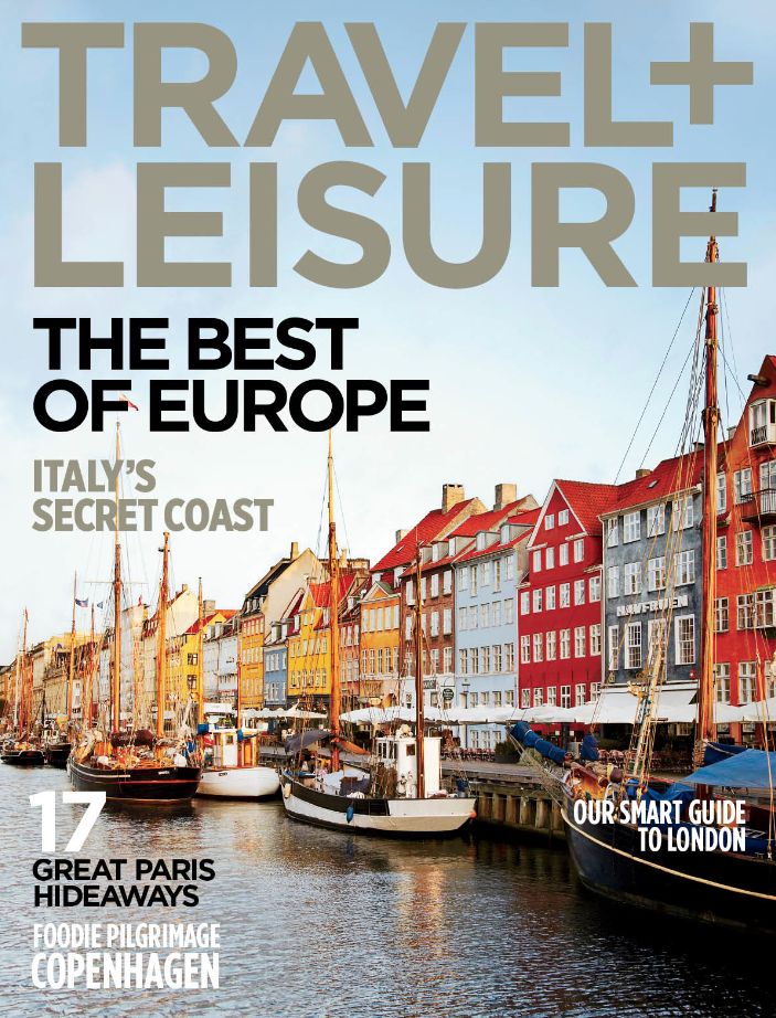
Since I've posted my last post, my partner and I have narrowed the genre choices to two. The two choices are a fitness magazine inspired by Women's Health or a travel magazine inspired by Travel and Leisure. As an avid traveler, I wanted to make a magazine on what I love most which is traveling with my family. My partner on the other hand is a fitness freak and wanted to make a magazine on something she loved most. We both decided to do research to prove our points to each other on which magazine genre we should choose.
To do research on the two genres, we sat down and looked through Women's Health magazine and Travel and Leisure Magazine and compared the two and this is what we came up with...

Womens Health:
-Usually consists of woman model on front (which may be hard for us to capture)
-Tips for working out
-Bold masthead; color changes
-Flashy coverlines

Travel and Leisure:
-High definition images
-Mostly all pictures of landscape so no need for people to photograph
-Very clean layouts
-Basic coverlines
-Masthead color changes
If Melanie and I chose to do travel it would consist of one issue on New Orleans and a special edition section on Mardi Gras and the other issue would be Miami since it is only a short car ride away to get great pictures. We would find the best restaurants and tourist attractions. If we chose Women's Health we would go to Melanie's gym and take pictures of people working out, diet tips and healthy foods. I promise the next blog post will reveal the genre we chose... I know the suspense is killing you!!
"Women's Health." Women's Health. N.p., n.d. Web. 12 Mar. 2017.
Locker, Melissa, Talia Avakian, Travel + Leisure Staff, Chris Abell, Dobrina Zhekova, Melanie Lieberman, and Rachel Chang. "Travel + Leisure." Travel + Leisure. N.p., n.d. Web. 12 Mar. 2017.
To do research on the two genres, we sat down and looked through Women's Health magazine and Travel and Leisure Magazine and compared the two and this is what we came up with...

Womens Health:
-Usually consists of woman model on front (which may be hard for us to capture)
-Tips for working out
-Bold masthead; color changes
-Flashy coverlines
Travel and Leisure:
-High definition images
-Mostly all pictures of landscape so no need for people to photograph
-Very clean layouts
-Basic coverlines
-Masthead color changes
If Melanie and I chose to do travel it would consist of one issue on New Orleans and a special edition section on Mardi Gras and the other issue would be Miami since it is only a short car ride away to get great pictures. We would find the best restaurants and tourist attractions. If we chose Women's Health we would go to Melanie's gym and take pictures of people working out, diet tips and healthy foods. I promise the next blog post will reveal the genre we chose... I know the suspense is killing you!!
"Women's Health." Women's Health. N.p., n.d. Web. 12 Mar. 2017.
Locker, Melissa, Talia Avakian, Travel + Leisure Staff, Chris Abell, Dobrina Zhekova, Melanie Lieberman, and Rachel Chang. "Travel + Leisure." Travel + Leisure. N.p., n.d. Web. 12 Mar. 2017.
Saturday, March 11, 2017
Here it goes...
When first being assigned this project, a million thoughts went through my head of what I should do: a magazine or a film opening? After finally getting over the first step by choosing to make a magazine with my partner Melanie Louis and as months passed, the project came into light again. We were informed about every aspect of this project which was clearly overwhelming. After the lecture on this project, I went home and began my blog...
So welcome to my blog! My name is Cali Kaufman and I am typically not the one to write blogs due to my introverted personality but here it goes. Having a blog is a little stressful due to the fact that I have to put all my thoughts, actions, failures, and successes on this one page but I will get it done.
I want my magazine to be something I am passionate about so it would be easier for me to formulate a story and actually want to put in my best effort for something I love. While being at home, I decided to look through my bin of magazines that my family is subscribed to that we get every week. A few sparked an interest like Travel and Leisure, People, Glamour, Women's Health and InStyle. All these different genres look so appealing and being an indecisive person definitely doesn't help.
The rest of the week I will devote myself to doing major, in-depth research to choose the best magazine for my partner and I to complete. Stay Tuned!
So welcome to my blog! My name is Cali Kaufman and I am typically not the one to write blogs due to my introverted personality but here it goes. Having a blog is a little stressful due to the fact that I have to put all my thoughts, actions, failures, and successes on this one page but I will get it done.
I want my magazine to be something I am passionate about so it would be easier for me to formulate a story and actually want to put in my best effort for something I love. While being at home, I decided to look through my bin of magazines that my family is subscribed to that we get every week. A few sparked an interest like Travel and Leisure, People, Glamour, Women's Health and InStyle. All these different genres look so appealing and being an indecisive person definitely doesn't help.
The rest of the week I will devote myself to doing major, in-depth research to choose the best magazine for my partner and I to complete. Stay Tuned!
Subscribe to:
Posts (Atom)